

Graphic design and branding
I design what I then build.
What it covers.
- Brand identity Logo, versions and the rules that keep it used the same way everywhere.
- Colour and typography The system that makes two pieces by different people look like the same house.
- Interface design The product screens, thought through with whoever is going to code them.
- Applied pieces Presentations, documentation, email templates and whatever the brand needs day to day.
- Printed material What still exists on paper: cards, catalogues, signage and trade fairs.
- Brand review Looking at what is already there and saying what survives, what gets adjusted and what has to be redone.
Brand and product, the same hands
The person who designs the brand is almost never the one who then builds the product it goes on. Here they are, and that changes where the identity ends up.
A brand manual is a PDF somebody has to respect. When the person writing it is the one writing the code, it stops being a PDF: the colour goes into the stylesheet, the typeface into the automated email template and the logo onto the invoice the system issues. Nothing is lost in translation.
It works the other way round too: designing while knowing what each decision costs to build saves you from handing over screens that have to be cut back later. The craft is Photoshop and Illustrator.
Brands I have worked on.
Product and company identity, from the logo to the website they introduce themselves with.
-
 Gestión Externa de Sistemas
Corporate image of the software company behind those products.
Gestión Externa de Sistemas
Corporate image of the software company behind those products.
-
 gobianas
Corporate image of the administration and operations professional profile: the mark, the palette and the site it introduces itself with.
gobianas
Corporate image of the administration and operations professional profile: the mark, the palette and the site it introduces itself with.
-
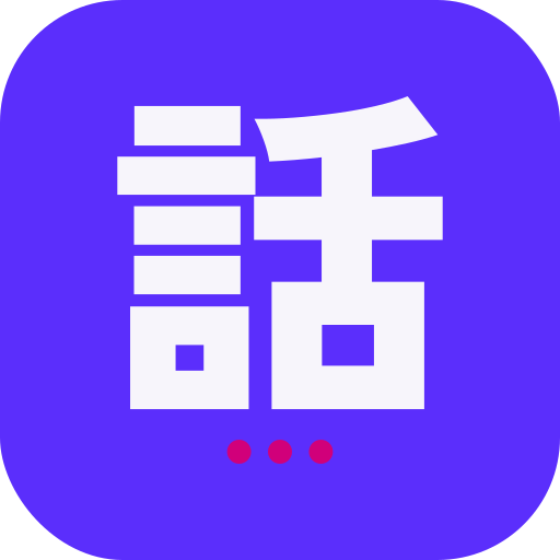 Hanasuka
Brand of the Japanese academy: the mark built on the kanji 話 and its colour system.
Hanasuka
Brand of the Japanese academy: the mark built on the kanji 話 and its colour system.
-
 ISOGESONLINE
Product identity for the ISO document management tool integrated with Sage 200C.
ISOGESONLINE
Product identity for the ISO document management tool integrated with Sage 200C.
-
 Jordi Salord
The brand I sign with: the logo and how it is used on the site, the card and the signature.
Jordi Salord
The brand I sign with: the logo and how it is used on the site, the card and the signature.
-
 Kimobox
Brand and visual identity of the process digitalisation platform.
Kimobox
Brand and visual identity of the process digitalisation platform.
-
 Kokai
Brand of the travel app: a looping road that leaves port and comes back to it, after 航海, “the voyage”, with its petrol and amber palette.
Kokai
Brand of the travel app: a looping road that leaves port and comes back to it, after 航海, “the voyage”, with its petrol and amber palette.
-
 M2Seed
Brand of the division that builds websites for small businesses: logo, visual system and the site it introduces itself with.
M2Seed
Brand of the division that builds websites for small businesses: logo, visual system and the site it introduces itself with.
-
 Petit Drac
Brand of the Catalan academy: a dragon cub, the one from the Saint George legend and the correfocs, puffing smoke rather than fire because it is still small.
Petit Drac
Brand of the Catalan academy: a dragon cub, the one from the Saint George legend and the correfocs, puffing smoke rather than fire because it is still small.
In more detail.
- How I decide what you see Interface, grid, colour and accessibility: the method and the terms of the craft, with their sources.
- The applications it is applied to The products whose brand and interface I designed, with links to see them working.
- And how it gets built afterwards What happens when the person drawing the screen is the one writing it.
Shall we talk?
Does your brand say what you do?
If you are not sure, show it to me and I will take a look.